 |
| PBVL//events |
Thursday, November 20, 2014


Wednesday, November 19, 2014


Thursday, November 13, 2014


Wednesday, November 12, 2014

Pottery Barn Homescent Redesign featured on THE DIELINE
Excerpted from thedieline.com


Country: USA

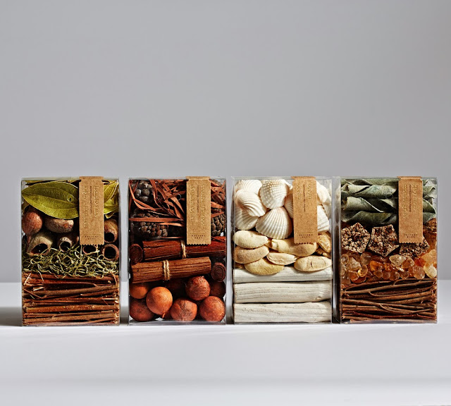
Having the opportunity to redesign and reinvent the Home Collection for Pottery Barn, this in-house team created an exquisite line that incorporated bold patterns, kraft paper labels with gold foil that created a beautiful contrast. A design that would look lovely in any home!
"We were given the opportunity to reinvent packaging for Pottery Barn's Homescent collection and wanted to create something less conventional than the standard oversized trays with acetate windows or acetate boxes with patterned inserts. We drew structural inspiration from fragrance packaging and reduced the size of the boxes to eliminate wasted space. To address the outer surfaces, we chose patterns developed by our talented in-house textiles team – traditional Mughal designs translated into mod graphic motifs. We love how the patterns relate back to the textiles we carry in our stores. It makes the whole program feel very unique and very Pottery Barn.
The kraft labels stamped with gold foil add to the rustic luxe vibe we were looking for. Kraft is a material that's used a lot in our branded packaging, so it was important for us to tie that element back to the program. Another feature of the packaging is its giftability. The patterns inside each box offer contrast and visual pop, and since the boxes are constructed with friction locks instead of glue, each can be folded inside out to hide all of the branding. It's the perfect solution for a last-minute gift."


Designed by Pottery Barn
City: San FranciscoCountry: USA
Subscribe to:
Comments (Atom)